
Vodafone
Click & Collect
AN OMNI-CHANNEL SERVICE/UX/UI PROJECT
Client: Vodafone Australia
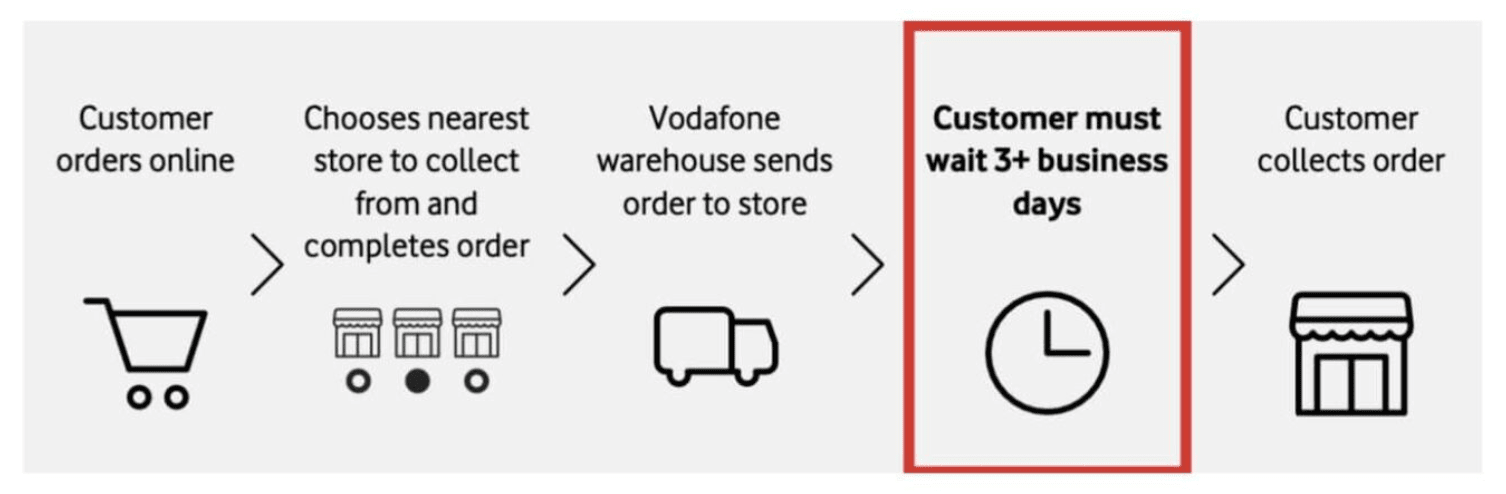
Customer Problem: While Vodafone offered Deliver to store, they couldn’t offer order and collect same-day to customers needing urgent and/or safe collection
Business Challenge: – Designing an omni-channel experience for Vodafone’s Click & Collect
– Design an MVP solution for selected stores only that worked without real-time store data to test customer desirability
My Role: Design and test a pilot, cross-channel Click & Collect experience
Discovery
Understanding the current state
In-store surveys, contextual observations, interviews
To better understand the business and customer problem, I wanted to know more about the impact to business and the customer need for Click & Collect.
I started by mapping out the current state through several enquiries.
Customer needs for Click & Collect
Current in-store pick-up experience and staff needs
Previous research/data about customer problems
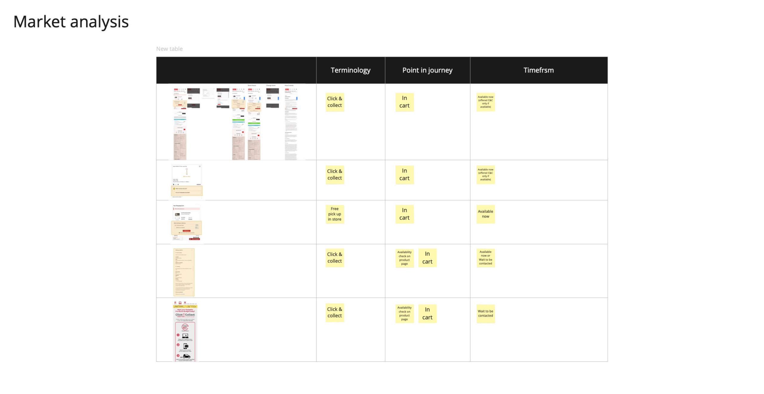
‘Click & Collect’ Terminology
After reviewing previous research and talking to Customer Support, I headed into store, interviewing staff handling ‘Deliver to store’ collections and observing these collections.
I also spoke to several customers using a survey app on my mobile to understand why they would need or want Click & Collect, and to get insight on there expectation of pick-up time in store.
Key Insights: Customers’ two key needs for C&C were ‘Urgency’ (to obtain the latest model fastest or to urgently replace a broken or lost phone) and ‘Security’ (Low trust in security of delivery method or address)
Also, as ‘Click & Collect’ was a new concept at this time, stakeholders were conflicted over whether we should call it Click & Collect or Pick Up In-store, so I asked customer about their comprehension of the terminology.
Main Insight:
Customer needs are about security, urgency, and savings
Staff need to confirm identity, check device for damage, and get a signature
‘Click & Collect’ as a term was well-understood
‘Click & Collect’ Terminology
Important Insight:
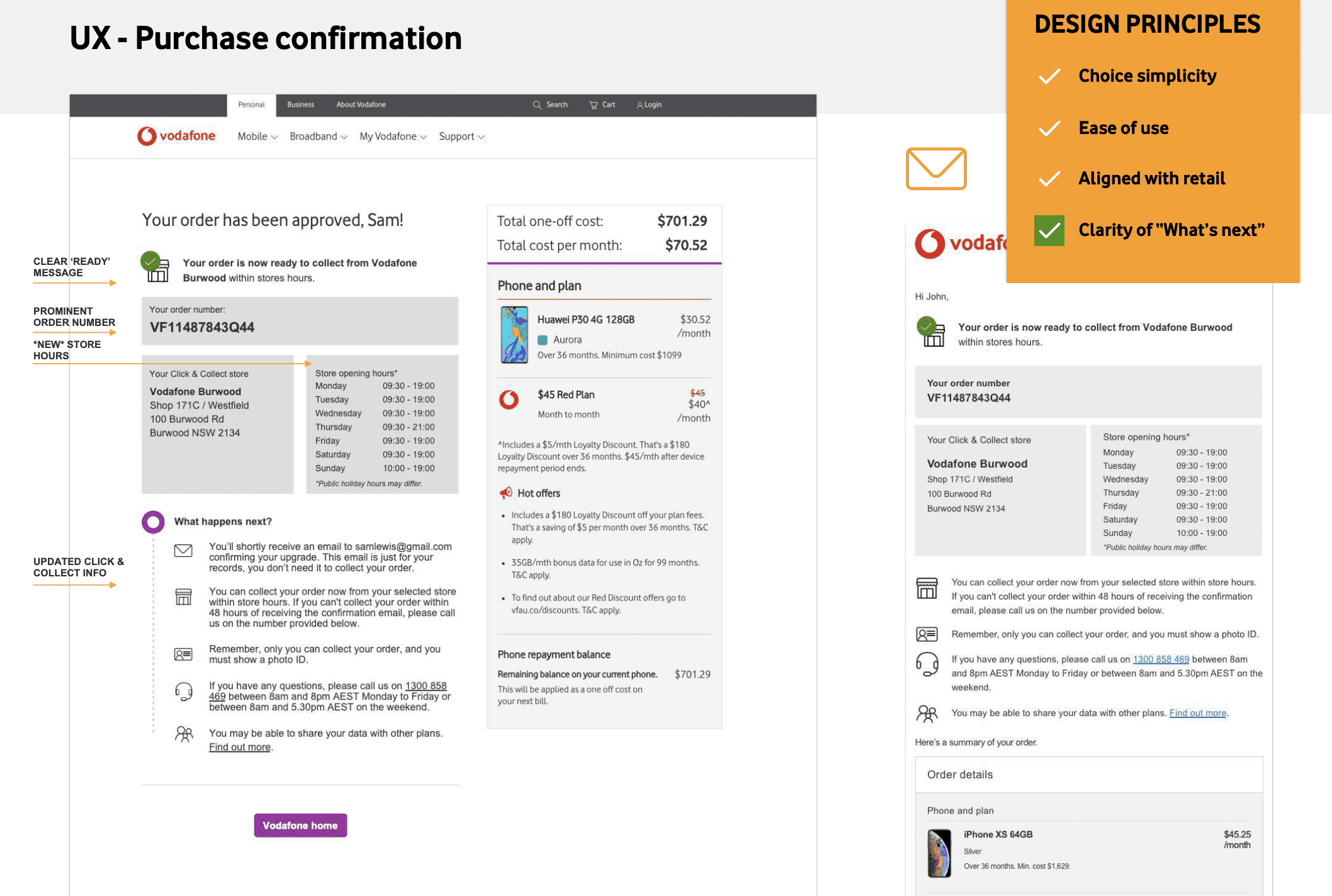
In-store staff confirmed what had Customer Care had said about post-purchase pain and they identified the cause—the post-purchase emails were not clear about what customers needed to bring in (ID, ID type, etc.)
These insights gave me clear design directions:
Customer needs are about security, urgency, and savings
Staff need to confirm identity, check device for damage, and get a signature
‘Click & Collect’ as a term was well-understood
‘Click & Collect’ Terminology
Key design direction:
Ensure communication and experience are consistence across digital and in-store channels

Determining terminology
In-store surveys, data analysis, market analysis
Now knowing ‘Click & Collect’ as a term was well understood by customers, we needed to explore how we used it with the existing offering ‘Deliver to Store’, so I ran a small investigation to get data and evidence to determine the terminology.

Mapping a customer journey
Journey mapping
While we had the ‘Deliver to store’ journey mapped, I really wanted to experience a Click & Collect journey, so I chose Click & Collect for one of my own personal purchases. I bought a bike from Kmart and mapped my experience over days and across channels.
The experience fell apart after the online purchase, with the email not being clear about next steps, lack of alignment between what was online and what care said on the phone.
The personal experience also gave me great empathy for the user and made me more determined to ensure a clear and consistent experience.

Key insights: I was reminded of the importance of communicating the next steps not only for the happy scenarios but also for the unhappy scenarios, such as the need to change an order, etc.
Updating the key design direction:
Ensure communication and experience are consistence across digital and in-store channels and during the transition between for all edge-case scenarios
UX Pattern research
Desktop research
I also researched existing C&C models online.
Key insights: Click & Collect was not always offered as same-day, and patterns usually offered ‘search for a store location’ first and were then told the delivery time-frame.
A key UX insight:
Don’t make users choose a time-frame first
Defining the design brief
Design principles
I synthesized the discovery research into needs and design principles to guide the UX and Development.
Design Principles:
Align information across channels
Ensure online, email, and phone communication information at purchase and post-purchase align with in-store processes
Choice simplicity
Group ‘Deliver to store’ and ‘Collect today’ into the one ‘Click & Collect’ option
Keep experience needs-based
Keep experience fast for urgency, private for security, and clear for simplicity
Aligning stakeholders
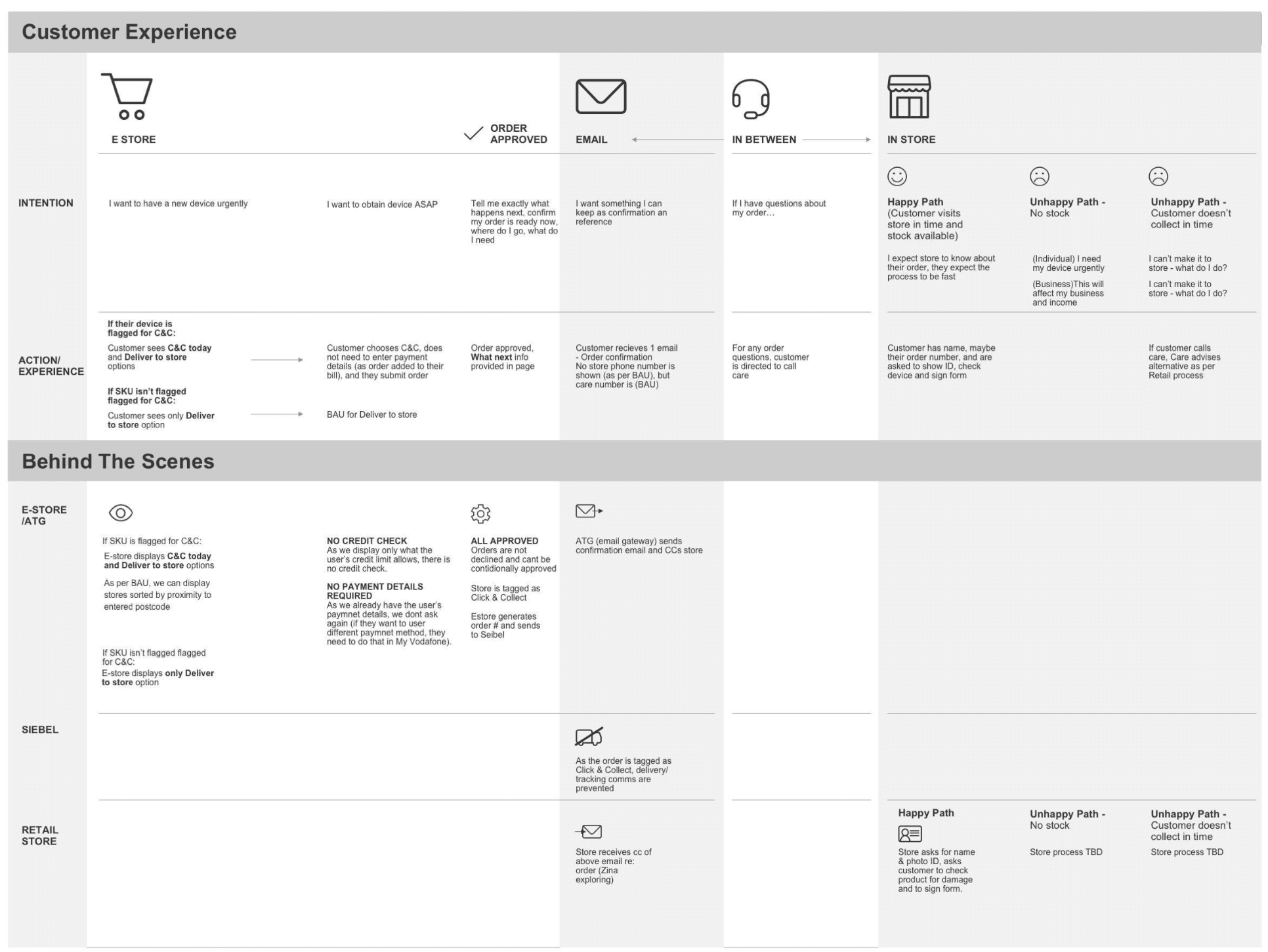
To address the potential lack of consistency across channels, I created a ‘lite’ service blueprint to ensure we were all aligned on customer and staff expectations for the C&C MVP.
I also played back the blueprint, design principles, and research findings to all stakeholders to give them an opportunity to give feedback.
Design
UX/UI Design
The C&C journey needed to be embedded in the existing checkout and post-purchase communication, it was quicker to edit an existing hi-fi prototype than create new wireframes so I could accurately test the complexity of the checkout experience.
I used the design principles as a guide to ensure the customer and staff needs and pain points were properly addressed at every stage.


Development support
Pre-launch journey testing
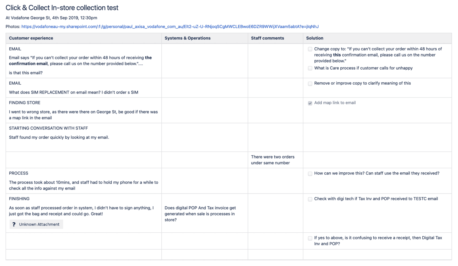
To test the experience and ensure customer and staff needs were met, I participated in an end-to-end test of our CLick & Collect experience prioir to launch.

Outcomes
My customer-led research approach (journey mapping, in-store surveys), combined with agile stakeholder engagement and real-world, end-to-end customer journey testing contributed to a successful launch that was then expanded into a proper strategic solution. across all stores and states.

Informing the digital transformation
In the following year, Vodafone underwent a digital transformation program to streamline the backend systems, business processes, and website experience.
As part of this transformation, I worked with the Service Designer to evolve my pilot Click & Collect experience into a complete iteration using real-time store data.


More projects
Research|UX|UI
Evolving an accommodation booking app
UX|UI
Redesigning a more secure login and preparing customers for change
User Research
Simplifying advice to parents and carers to help them support their child
Research|Service|UX
Modernising Australian Export Regulatory Process
UX/UI