HotelsCombined App/Site Redesign
A UX/UI PROJECT
Client:
HotelsCombined
Business Challenge:
Improving a successful hotel search experience to remain competitive in a hyper-crowded market, and deliver value to a wide range of users and needs
My Role:
As the only UX Designer for HotelsCombined, I worked closely with the Product Owner and Development Team to design bot business-led solutions and ones I identified through research.
Introduction
During my 13 months as Senior UX Designer, I redesigned all facets of the product, from the member’s account and calendar, to the booking funnel and map search views.
1. Booking calendar and search redesign
2. Designing a traveller type needs-based experience
3. Optimising the journey for all traveler types
Improving the booking calendar and search
PROBLEM: While the app that was already doing well in the market, its booking calendar was a little clunky and unintuitive. I involved the developer who worked on the original calendar, inviting him to join me in the process to advise on technical considerations for the solution ideas.
A frictionless experience all depended on the smoothest micro experiences, such as when a user chose a check-in date and the UI auto adjusts to allow them to select the check-out date.
User testing and market research
To validate our concerns and determine all the friction points, I gave users simple tasks to perform on our existing calendar, and compared the experience to other leading booking apps to identify better patterns.
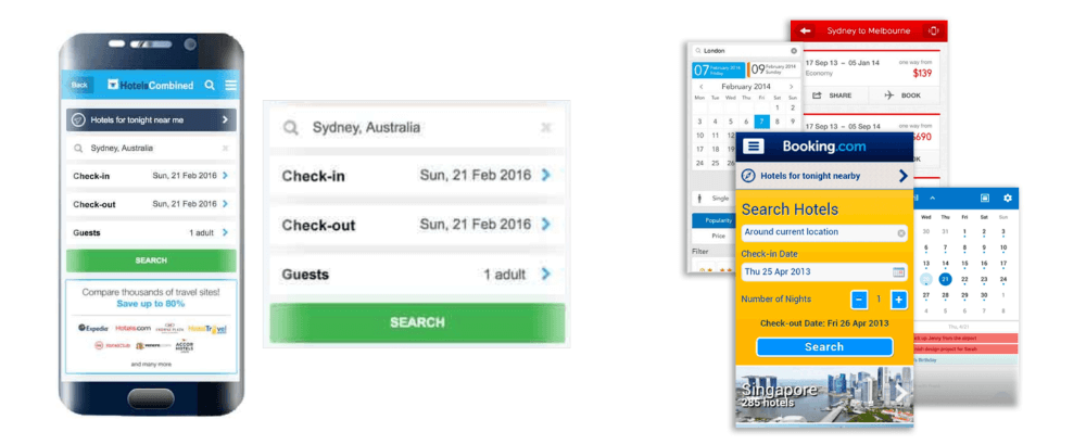
The user needed to open and close the date selector separately to set the check-in and check-out dates
The calendar didn’t auto adjust to entering check-out date after entering check-in date
The calender should auto close once the check-out date has been selected—but not too fast!
The calendar did not auto fit/adjust its vertical position
Ideation & Testing
I tested various solutions to determine the best combinations of micro-interactions.
I then evolved the design and A/B tested with the existing experience, which it succeeded in out-converting.
Try the prototype to see the micro-transitions
Book a trip from the 8th to the 13th.
2. Designing a traveller type needs-based experience
PROBLEM: The app/website didn’t talk specifically to traveller types, such as couples, family, etc. which meant finding accomodation for specific traveller wasn’t as streamlined as other products.
Research
To better understand traveller types, I researched industry leaders and travel sites to identify the five main traveller types and their most common names.
The 5 Traveller Types
Solo
Couples
Family
Group
Business
Determining needs specific to traveller types
To understan dthese profiles better, and to understand their specific needs, I reviewed user feedback comments from 40+ more travel sites, industry sites, and travel blogs, focusing on ones that displayed user comments and feedback, to compile key words that traveller types used to describe their specific needs and to determine relatable terminology.
A Key Insight: The 5 traveler types had their own sub groups with different needs.
Mapping needs to accomodation features
With this more succinct understanding of traveler types, I mapped traveler type needs to our hotel features to display preset filters and/or recommendations per traveller types.
Pattern testing
I designed various filtering experience and we A/B tested these against the existing experience.
Outcomes and learnings
Outcomes
Users engaged with the filters but they did not show any significant increase in bookings. However we found another use for the needs-based filter by using the information to display different photos per traveller types that showed more of what they were after.
Learnings
Understanding desirability for filters and how they can be better designed could have been gained earlier through early concept testing.
3. Optimising the journey for all traveller types
PROBLEM: How could we ensure key pages provided for the key needs for all traveler types?
Co-design workshop
EXPLORING THE END-TO-END JOURNEY
The entire HotelsCombined team had a lot of ideas, and they collectively represented all of our traveler types.
Since we didn’t have a big budget for focus groups, etc., I gathered together staff from across the business, who represented all personas, and ran a workshop to explore how they booked a holiday, allowing them to design their solution from initial research to clicking ‘Book now’ to arriving at the hotel.
I asked each participant to map out their experience on the wall from when they start planning a holiday, to searching, booking, arriving at accommodation, and through the stay—talking aloud as they did—to create booking experience timelines from multiple perspectives.
Participants talked us through their journeys, needs, and pains, as I captured notes.
I later analysed these journeys to determine what were the common needs and content elements preferred by all traveller types at each stage.
FOCUSING ON THE SEARCH RESULTS PAGE
I then asked the group to review competitor search-result page designs to capture their thoughts about what worked form them and what didn’t, which we talked through and I analysed later
Participants gave the pages an overall result using a happy, sad, or neutral face—this helped give us an immediate visual result we could discuss.
Outcomes
The collective insight from the workshop helped guide wireframes for a refined booking journey that in the first instance catered for the key needs of travellers, while providing easily accessible information specific to traveller types.
4. Home screen and Member's Account redesign
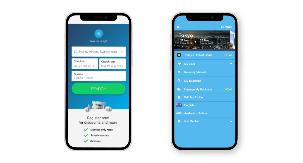
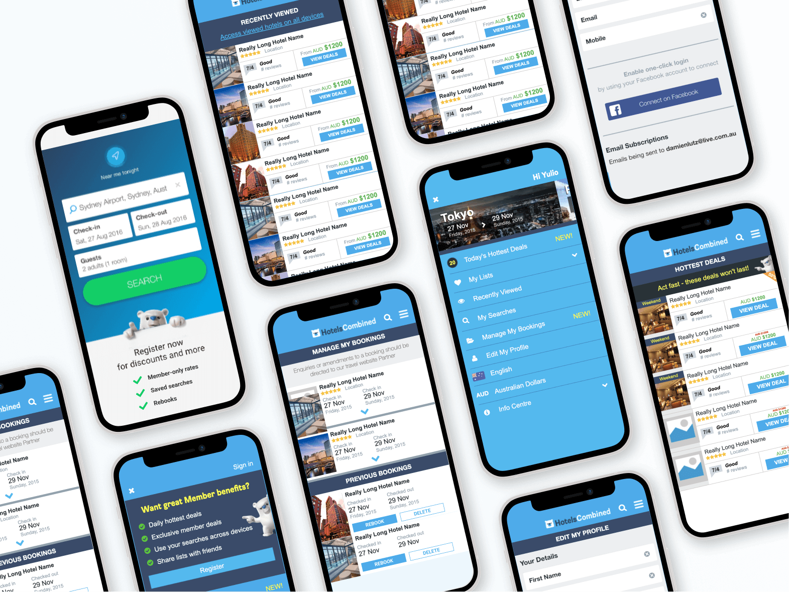
I also completed the redesign of the home screen and the Member’s Account.
For the member’s account, I drew ideas from a market analysis and the the traveller needs co-design workshop to mock up concepts for user-testing. I evolved the account from a simple single profile page to a small suite of tools to help booking, such as wish lists, saved searches, etc.
I also designed a fresh new home screen, bringing in the polar bear mascot, as branding was a key differentiator for hotel booking apps which otherwise offered the same functionality.
Collective outcomes
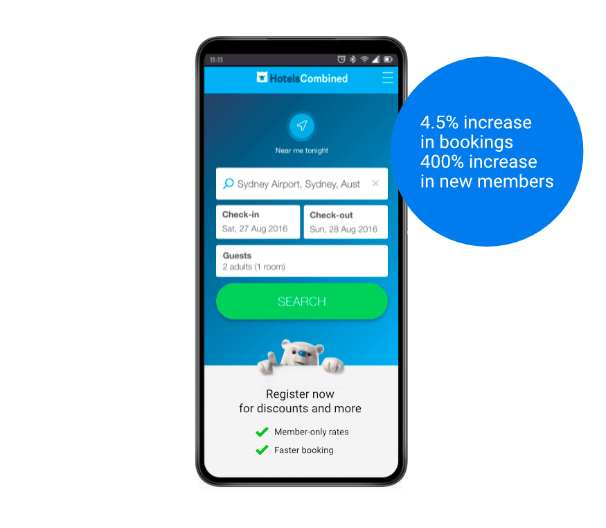
Combined with my redesign of the home screen, these initiatives contributed to a 4.5% increase in bookings and 400% increase in customer accounts in the first few months, which was significant in such a competitive market with powerful players such as booking.com, Expedia, and Trivago.
More projects
UX|UI
Designing Vodafone's first AI Chat Bot
UX|UI
Redesigning a more secure login and preparing customers for change
User Research
Simplifying advice to parents and carers to help them support their child
Research|Service|UX
Modernising Australian Export Regulatory Process
UX/UI
