
Communicating complex discounts at point of purchase
UX CASE STUDY | DAMIEN LUTZ
Overview
About
Challenge:
Communicate a complex, compounding discount system at checkout — without overwhelming users with eligibility rules or slowing down sales
Client:
Vodafone
My Role:
Lead Product Designer
Key Outcomes
45% lift in conversions
In the first few days after launch
A failing concept caught before launch
Testing exposed information overload early enough to fix it
Built for three different readers
Skimmers, Readers, and Detailers all served without burying anyone in detail

Discovery
A loyalty problem led to a genuinely hard communication challenge
To address a validated lack of customer loyalty, Vodafone created Bundle & Save—a discount on every second, third, or additional service a customer had or purchased. The hard part was the complexity: every service combination was eligible, the discount compounded the more services you bought, and the offer was rolling out in three phases, each with different data available to show users.
As this was a pre-approved concept, my focus was scoping it, then moving into ideation and testing comprehension of the copy.
Profiling and scoping
I mapped a matrix of user groups—new customers, existing customers, existing customers upgrading, existing customers adding NBN, and more—then mapped where Bundle & Save information needed to appear across the Vodafone journey, from awareness and marketing through to checkout.


Profiling the various customer types
Early concept testing
I created a visual to explain the concept clearly, to run early comprehension testing.

The Bundle & Save discount visual concept for early comprehension testing
100% really liked the offering
“Great save” | “Makes me want to buy”
95% understood the offering, without prior knowledge
“A welcome surprise” | “The more services I have under one account, the more I save”
75% would move telcos
But would need reassurance about saving and Vodafone
“It’s an easy process” | “I would change for $10/mth saving” | “It’s not a hassle”
Design
Pattern research and ideation for communicating discounts
To prepare for design, I researched how discounting was communicated by competitors and by other industries, capturing patterns and sketching along the way.

Sketching ideas from in-market discount communication
Testing eight new and eight existing users exposed a real problem
I ran a sketching session with the wider squad to generate ideas from non-designers, then developed the strongest ideas into first-iteration wireframes, building toward hi-fi designs as testing progressed.
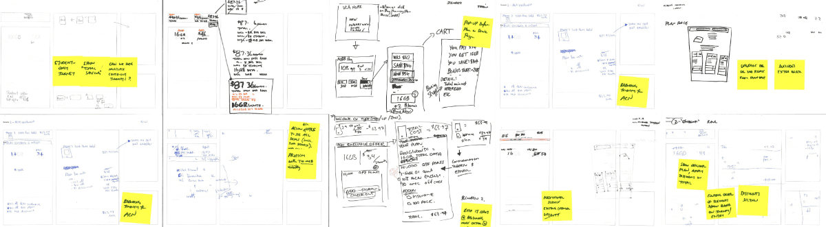

From sketches to wireframes
We tested eight new and eight existing users through different scenarios, mapping results on the wall with colour-coded sticky notes—pink for failure. The pattern was unmistakable: large patches of pink showed the initial concept wasn’t working.

Sticky notes on a giant white board synthesising user testing feedback
Information overload at the worst moment
In Cart and Checkout, users didn’t want discount rules and eligibility detail thrown at them — that needed to live earlier in the journey
But the detail couldn’t disappear entirely
Some users would stall and call Customer Care without it, so it still needed a home
Three reader types meant one message couldn’t fit all
Testing showed users split clearly into three types, and the design needed to speak to each differently:
Skimmers
Just want to know what they’re paying, no interest in how discounts are calculated
Readers
Want to know the reasons for the discount and how it’s calculated
Detailers
Want the reasons, the calculation, and the eligibility rules behind it
I used a mix of content and styling strategies to serve all three without overwhelming any of them, alongside a variation matrix to speak more directly to new and existing customer needs.

Discount communication banner for scenario variations
Outcomes
After launch, conversions rose 45% in the first few days—strong evidence that customers understood the new compounding discount offer and saw real value in it.
A failing concept caught before launch
Initial testing showed the first design overwhelmed users with rules and clashed with other offers; testing exposed this early enough to fix it
Solved for conflicting user types
Designing content and styling that served Skimmers, Readers, and Detailers, without burying anyone in information, was the core of what made the launch work
Reduced complexity into something sellable
A compounding discount, eligible across every service combination, rolled out in three phases with different data available at each, explained clearly enough at checkout to lift conversions