
Designing a pilot Click & Collect experience for Vodafone
UX CASE STUDY | DAMIEN LUTZ
Overview
About
Challenge:
Vodafone could offer “Deliver to store,” but also needed to offer same-day order-and-collect for customers who needed urgent or secure pickup.
Client:
Vodafone
My Role:
Lead Product Designer
Key Outcomes
77% collected within 3 hours
And every customer surveyed said they’d use Click & Collect again
Strong, steady demand
Orders came in steadily across the week, including a strong share outside business hours
A succesful validation for full investment
The MVP proved enough value, without real-time store data, to justify a full rollout

Discovery
On-site interviews and a personal purchase exposed where the experience broke down
To understand the business and customer need for Click & Collect, I started by mapping the current state through several enquiries:
Customer needs for Click & Collect
Current in-store pick-up experience and staff needs
Previous research/data about customer problems
“Click & Collect” terminology
In-store interviews with staff
After reviewing previous research and talking to Customer Support, I went in-store — interviewing staff who handled “Deliver to store” collections and observing the process directly. I also surveyed customers on my mobile to understand why they’d want Click & Collect, and what pick-up time they’d expect.
Customers wanted urgency and security
Getting the latest model fastest, replacing a lost or broken phone, or simply trusting in-store pickup over a delivery address.
Staff needed to confirm identity, check the device, and get a signature
Every collection had the same in-store requirements.
Important and validated insight to champion
In-store staff confirmed what Customer Care had already suspected — and identified the cause: post-purchase emails weren’t clear about what customers needed to bring in (ID, ID type, etc.).
Most customer pain was post-purchase
Post-purchase emails weren’t clear about what customers needed to bring in (ID, ID type, etc.).
Optimise post purchase experience
Ensure communication and experience are consistent across digital and in-store channels.
A side investigation settled the “Click & Collect” naming debate
Was “Click & Collect” a familiar enough term?
As Click & Collect was a new concept at the time, stakeholders were split on whether to call it “Click & Collect” or “Pick Up In-store.” I ran a small investigation, surveying customers directly, to settle it with evidence rather than opinion.

A terminology investigation to settle an internal debate about what Click & Collect should be called
“Click & Collect” wins
“Click & Collect” was already well understood by customers, and it should be the term we use.
Click & Collect discovery insights

Click & Collect discovery insights
Testing a real-world Click & Collect showed exactly where the journey fell apart
While we had the “Deliver to store” journey mapped, I wanted to experience Click & Collect firsthand—so I bought a bike from Kmart using their service, and mapped my own experience across days and channels.
The experience fell apart after the online purchase: the confirmation email wasn’t clear about next steps, and what I saw online didn’t match what Customer Care told me on the phone.

Journey mapping a real-world Click & Collect experience
Edge cases matter as much as the happy path
The experience needs to communicate next steps clearly for changes, delays, and other unhappy scenarios too, not just a smooth collection
Optimise cross-channel communications to minimise post-purchase pains
Ensure communication and experience stay consistent across digital and in-store channels — including during transitions and edge-case scenarios.
Existing Click & Collect models confirmed one more design rule
I researched existing Click & Collect models online to see how others approached the problem.
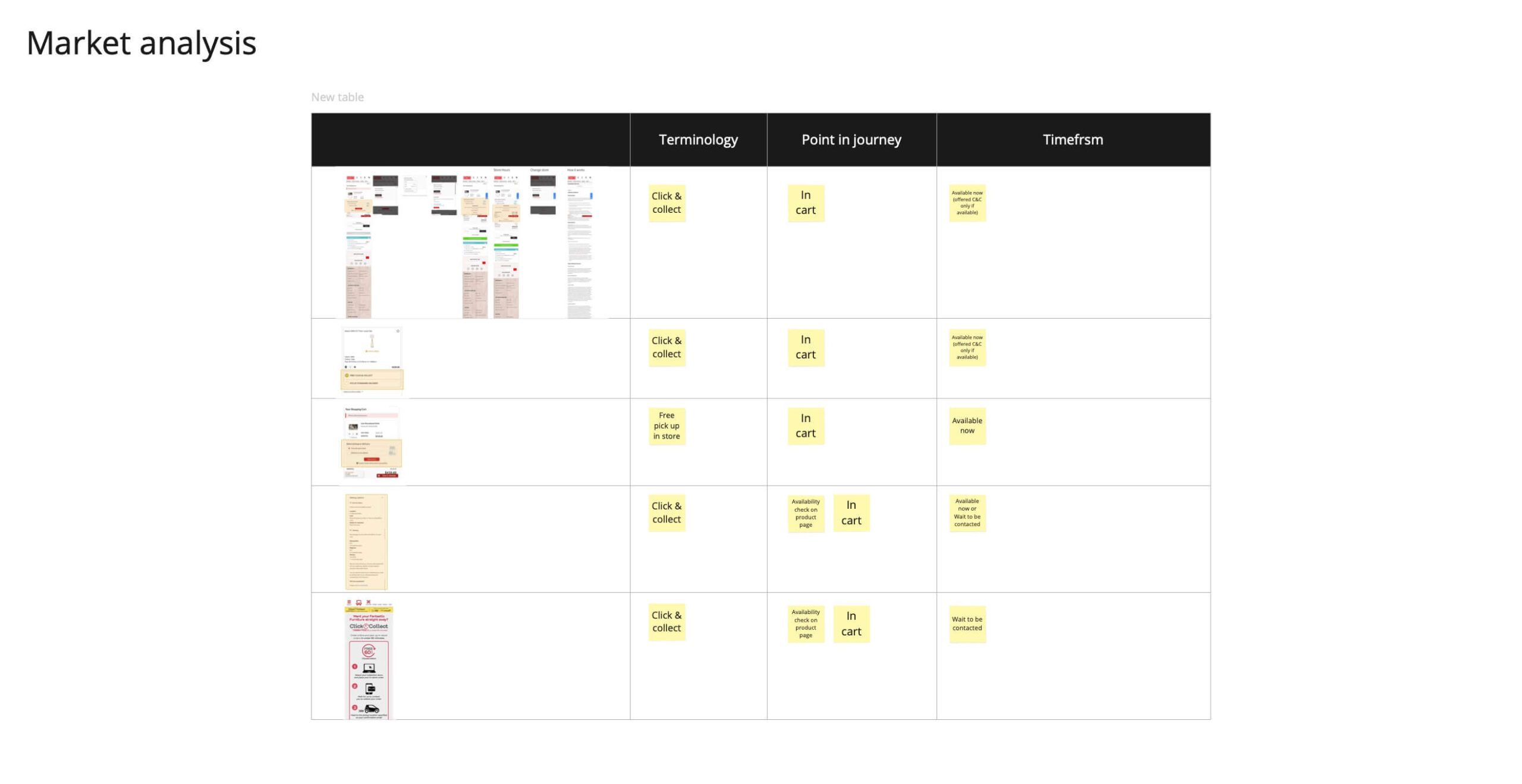
Market scan of Click & Collect ordering experiences
Don’t make users choose a time-frame first
Click & Collect wasn’t always offered same-day, and most patterns asked users to choose a store location first, before being told the delivery timeframe.
Defining design principles to guide us
Research became three design principles to guide build decisions
Align information across channels
Ensure online, email, and phone communication match in-store processes, at purchase and post-purchase
Choice simplicity
Group “Deliver to store” and “Collect today” into one “Click & Collect” option
Keep experience needs-based
Fast for urgency, private for security, clear for simplicity
Applying a service lens
My ‘lite’ service blueprint kept stakeholders aligned
To keep stakeholders across channels aligned on our goal to optimise the cross-channel communications and experience, I created a “lite” service blueprint covering customer and staff expectations for the MVP, then played back the blueprint, principles, and research findings to the wider team for feedback.

A ‘lite’ service blueprint to keep cross-channel stakeholders aligned (Blurred for privacy)
Design
Editing a live prototype let us test the real checkout complexity
The Click & Collect journey needed to live inside the existing checkout and post-purchase communication. Editing the existing high-fidelity prototype let me accurately test checkout complexity, rather than building new wireframes from scratch.
I used the three design principles as a guide throughout, to make sure customer and staff needs were addressed at every stage.

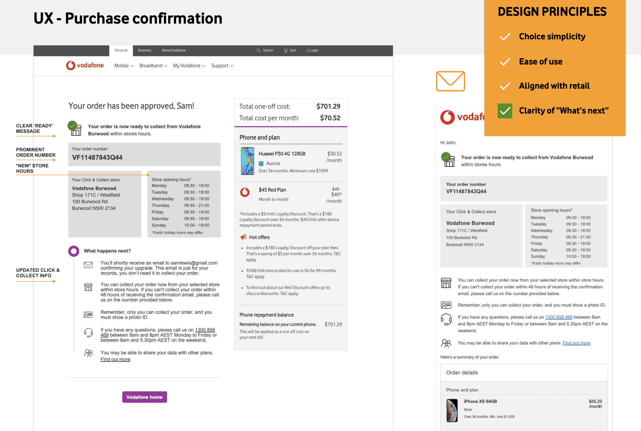

The Click & Collect UX and how it’s base on the design principles
Service testing
An end-to-end test confirmed the experience before launch
To make sure customer and staff needs were genuinely met, I took part in a full end-to-end test of the Click & Collect experience prior to launch.

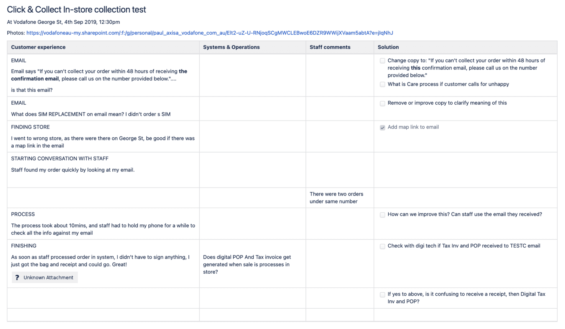
Testing the real Click & Collect experience and determined improvements
Outcomes
Zero issues in the digital journey
The pilot launched with zero issues reported in the digital journey, 77% of customers collecting within 3 hours, and every customer surveyed saying they’d use Click & Collect again — then expanded into a full strategic rollout across every store and state.

Clcik & Collect post-launch results
Zero digital issues
Zero issues reported in the digital journey
Customers collected fast and happy
77% collected within 3 hours, average 17 hours 31 minutes overall; every customer surveyed said they’d use it again
Staff adapted fast
Early confusion settled quickly once the process bedded in
Research settled a stakeholder disagreement
Customer testing confirmed “Click & Collect” was already the right term, ending the internal debate
MVP constraints didn’t stop the work from scaling
Designed and tested without real-time store data, the pilot still proved enough value to justify full investment
Personal empathy shaped the design brief
Buying a bike via Click & Collect myself, and watching the journey fall apart, surfaced exactly where the model broke down and became a concrete design principle: consistency across channels and edge cases
The successful pilot formed the foundation for a strategic rollout
A year later, this work fed directly into Vodafone’s wider digital transformation—rebuilt with real-time store data, working alongside the Service Designer on the updated service design and new designs.


Evolving the Click & Collect pilot into a wider strategic rollout