
Designing a secure login and preparing customers for change
UX CASE STUDY | DAMIEN LUTZ
Overview
About
Challenge:
Rising fraud and scams put customer data and money at risk
Client:
Vodafone Australia
My Role:
Lead Product Designer
Key Outcomes
90% completed login with ease
No prior experience of the new flow needed
Password reset calls dropped sharply
“Forgot password” was one of the most common contact reasons — magic links removed it almost entirely
Fraud risk down, friction low
After some initial friction, customers adapted fast

Understanding the problem
Passwords were now the risk, not the protection
Vodafone needed to move customers off passwords entirely. The Fraud Team’s preferred fix: a magic link. The user enters their number or email, gets sent a link by SMS or email, and clicks through to finish logging in.
- The user enters their number or email at login
- If it’s recognised, an SMS or email is sent with a link
- They open it and click through to finish logging in
Magic links also wipe out almost all authentication-related support calls — no more “I forgot my password.”

The secure login link concept
Market scan for best practices
Research into login security design set the bar for what good looked like.
Let people choose how they get the link
SMS and email, not just one
Send people straight to their own mail app
Based on what’s installed on their device
Design for cross-device journeys
Started on desktop, finished on mobile, and back again
Build in link expiry
Every magic link needs a use-by date
Never confirm an email or number is invalid
Confirming it exists hands fraudsters a way to test stolen data
Keep the journey consistent across channels
Same tone and pattern whether the link arrives by SMS or email
Service-by-service and user types journey mapping caught new gaps
Working with Fraud and dev, I mapped the login flow across every service type. The gap that mattered most: NBN and broadband customers often don’t know the mobile number tied to their account — the one detail the whole flow depends on.

Journey mapping for various service and user types
NBN and broadband customers didn’t know their own numbers
Design and testing
A design jam reminded us trust was as importnat as comprehension
Running a design jam with the team reframed the problem. It wasn’t just about whether people would understand a magic link—it was whether they’d trust losing their password at all.


Ideas and insights from the design jam I ran with my team
Copy carried more weight than the UI
Change aversion needed direct handling
Unhappy paths we hadn’t spotted yet
Friction specific to single journeys
Prototyping two designs for testing
Inspired by the journey maps and design jam insights, I designed two prototypes with a goal to test the level of direction and/or simplification the screen could have.


Initial hi-fi UX and journey designs
Preparing copy versions for testing
The copy was extremely important in reducing change aversion and abandonment due to lack of clarity, so I worked vary closely with the copywriter to ensure testing insight was used at every instance of copy along various entry points to the login journey.

Copy variations for multiple login points
Testing answered the trust question directly


Secure link user testing results colour coded for pass, fail, and needing improvement
More explanation beat less
Detail reduced change shock more than a stripped-back screen did
90% completed with ease
English-as-second-language users struggled somewhat — everyone valued not needing a password
People assumed “their” number
Most expected the link to go to the number on file with their account
The final design
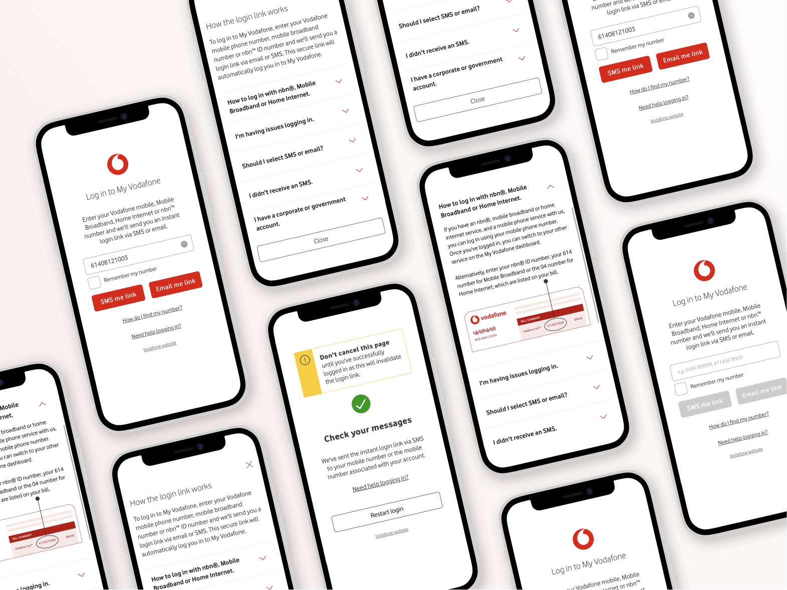
Preparing customers for the change
The dashboard had to carry the message, not the login screen
Some customers could skip login entirely via an off-net method, so the login screen alone couldn’t be trusted to reach everyone. The dashboard became the main channel for change messaging.
Off-net users needed dashboard messaging
Login screens alone wouldn’t reach them
NBN and broadband needed number guidance
Many didn’t know where to find it
Emails had to be current
Customers needed a prompt to check and update
Messaging had to stay live
People needed to see it more than once before launch

Outcomes
The magic link replaced passwords across web and app with minimal disruption and a measurable drop in fraud risk.
90% completed login with ease
No prior experience of the new flow needed
Password-related support calls dropped sharply
“Forgot password” and reset requests were among the most common contact reasons
Change aversion stayed low
Clear in-product messaging and tightly tested copy meant customers understood the change before they hit it
Edge cases caught before launch
NBN and broadband number confusion was solved in testing, not in a support queue