
Redesigning HotelsCombined’s app and web experience
UX CASE STUDY | DAMIEN LUTZ
Overview
About
Challenge:
Stay competitive in a hyper-crowded market (Booking.com, Expedia, Trivago) by delivering value to a wide range of traveller needs, without a big research budget
Client:
HotelsCombined
My Role:
Lead Product Designer
Key Outcomes
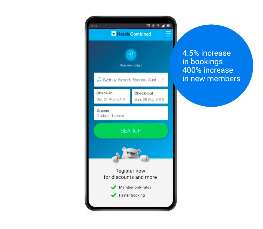
4.5% increase in bookings
Across the full 13-month redesign
400% increase in new accounts
Driven by a stronger home screen and account experience
Real research insight with no budget
in-house co-design workshops replaced the cost of formal focus groups
Booking calendar redesign
Micro-interaction friction was costing conversions
The booking calendar already performed well, but small interaction issues were creating friction. I brought in the original developer to advise on technical constraints as we worked through solutions together.
Testing the existing experience
I gave users simple tasks on the existing calendar, then compared the experience to leading competitor apps to find better patterns.
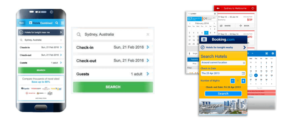
The original booking calender and in-market variations
Check-in and check-out needed separate steps to open and close
No auto-adjustment after selecting check-in
No auto-close after selecting check-out (without feeling abrupt)
No auto-fit to the screen’s vertical position
Ideation & testing
Book a trip from the 8th to the 13th.

A terminology investigation to settle an internal debate about what Click & Collect should be called
Home screen & account redesign
Branding became the differentiator that pure UX couldn’t
I redesigned the home screen and Member’s Account, drawing on market analysis and the traveller-type workshop (see next section) for ideas.
The account evolved from a single profile page into a small suite of booking tools — wish lists, saved searches, and more. For the home screen, I brought in the polar bear mascot, since branding was one of the few real differentiators in a market where most competitors offered near-identical functionality.
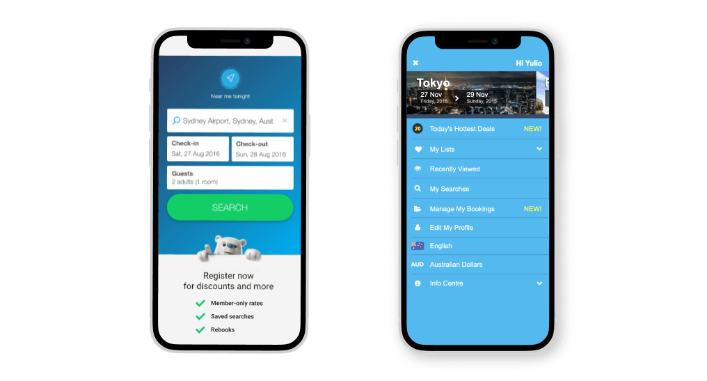
Designs for the new home screen and member’s account for the HotelsCombined app (1)
Customising experiences for traveller-types
Travellers needed more than one-size-fits-all accommodation
The app didn’t speak to specific traveller types—couples, families, solo travellers, and others—making it harder for them to find the right accommodation, and harder for key pages to serve every type’s needs, without budget for formal focus groups.
Defining the traveller types
Market scan
I researched industry leaders and travel sites to identify the five main traveller types and their most common names: Solo, Couples, Family, Group, Business.

Senior UX Designer Damien facilitating a user research workshop
Understanding their specific needs
I reviewed feedback and comments across 40+ travel sites, industry sites, and blogs to find the language travellers actually used to describe their needs.

Traveller Type Sub Groups and their needs
Each traveller type had its own sub-groups, each with different needs
Mapping needs to features
I mapped traveller needs to our hotel features, to surface relevant filters and recommendations by traveller type, then designed and A/B tested several filtering approaches.

Filters for traveller types for A-B testing
Filters didn’t lift bookings
But the underlying research found a second use: traveller-specific photography that better matched what each type was looking for
Desirability testing should have come earlier
Concept testing the filters sooner would have surfaced this before full design investment
A no-cost in-house workshop replaced the research budget we didn’t have
Team workshop exploring traveller type needs
I gathered staff representing all our traveller personas and ran a workshop mapping the journey—from planning, to searching, to booking, to arrival—with each person talking through their own experience as they mapped it.

Senior UX Designer Damien facilitating a user research workshop
Focusing on search results
I asked the group to review competitor search-results pages, rating each with a happy, sad, or neutral face for a fast read on what worked and what didn’t.

Brainstorming ideas from a user research workshop exploring traveller type needs
Insights into wireframes
The collective insight shaped wireframes for a refined booking journey, covering the key needs shared across traveller types.

UX wireframes for the HotelsCombined Search results and hotel pages
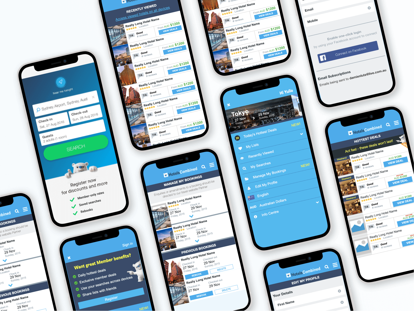
Final UI
Outcomes
Across the calendar redesign, traveller-type experience, and home screen and account redesign, the combined effort delivered a 4.5% increase in bookings and a 400% increase in new customer accounts in the first few months — a meaningful result in a market dominated by Booking.com, Expedia, and Trivago.
Resourcefulness replaced budget
In-house co-design workshops produced the insight a funded focus group programme would normally deliver
Branding became a genuine differentiator
Bringing the polar bear mascot into the home screen gave HotelsCombined a point of distinction pure UX improvements couldn’t
A flat result still created value
The traveller-type filters didn’t lift bookings, but the same research paid off through better-targeted photography