
Designing Vodafone’s first AI-powered chatbot
UX CASE STUDY | DAMIEN LUTZ
Overview
About
Challenge:
Reduce customer waiting time for support and reduce calls to the Support Team
Client:
Vodafone Australia
My Role:
Lead Product Designer
Key Outcomes
39% calls resolved
TOBi handled over a third of customer enquiries in its first weeks live
Minimised drop-off
Thorough multi-OS testing minimised onboarding friction
Globally aligned, within budget
Matched Vodafone Global’s design creatively to avoid extra build and budget

Understanding the problem
First, I mapped the top customer support issues
My initial step was interviewing Customer Care to understand their needs and the key customer enquiries TOBi would need to handle. This gave us the top enquiry subjects, which shaped the initial conversation prompts, ending scenarios, and early copywriting direction.
To complement this, I researched how people talk about chatbot experiences more broadly, drawing on usability write-ups and the kind of frustrations customers post in forums and reviews when chatbots get it wrong. A few recurring themes stood out
People hate repeating themselves
Vague or off-topic answers erode trust fast
Loops are the fastest way to lose someone
People want chat to feel like chat, not a form
Then I mapped the market to identify elements and journeys
I reviewed existing chat experiences across the market—and in other industries—to understand established patterns before defining our own direction.
8 Key journeys
12 Key UI elements
4 Informative animations
Experience design principles to guide us
I synthesised all of the above into four guiding principles for every UX and UI decision from here on.
Fast
Get people an answer without delay
Meaningful
Responses that actually solve the enquiry, not just acknowledge it
Intuitive/Familiar
Chat patterns people already know from everyday apps
Frictionless
No unnecessary steps between problem and resolution
Understanding the UX/UI limitations
The out-of-the-box platform was not fully customisable
I built basic wireframes of the happy path and a few conversation variants. These became the visual starting point for conversations with the third-party provider, so we could find out fast what their platform could and couldn’t do.
I then went through every UI element and layout — spacing, colour, type — to map exactly what I could change.
Working with the 3rd Party was iterative and involved constant check-ins as the UX/UI became more defined.
Doing this upfront saved time and rework.


Wireframes of key screens created to start the conversation about the platform’s limitations

Mapping the platform’s UI customisability
We needed to balance global brand UX with budget
Each country could evolve Vodafone’s Global Design, but the long-term goal was one design that worked everywhere. Matching Global as closely as possible was a real requirement, not a nice-to-have.
I mapped Global’s existing patterns against our journeys to see what we could keep, then prepared specific questions for the UK team.
Where too costly to rebuild, we matched the style instead
Designing, testing, and problem-solving
Designing the key flows and elements
Drawing on research into chatbot patterns, customer needs, platform limitations and global UX directions, and led by the design principles I’d defined, I evolved the wireframes of key flows and journeys into high-fidelity designs — starting with the core conversational elements and interactions, styled against the app’s style guide and common chat UI conventions.


Key journey UX


Interaction elements
Testing revealed an unseen unhappy path
In Phase 1, the chat button only lived on the home screen. If TOBi sent someone to another page and they had more questions, they had to navigate all the way back to ask.
How might we make it easier to get back to chat from anywhere?

A ‘back to chat’ feature for when content provided by chat was not relevant
Addressing native OS experiences not supported by the platform
TOBi’s replies could land a day later, so notifications mattered. Normally, apps prompt for notifications with a native OS pop-up. Our platform didn’t support that — users had to be sent to Settings manually instead.
I mapped the iOS and Android journeys separately to check for drop-off. iOS users had to manually return to the Vodafone app afterwards — the riskiest step in the flow.
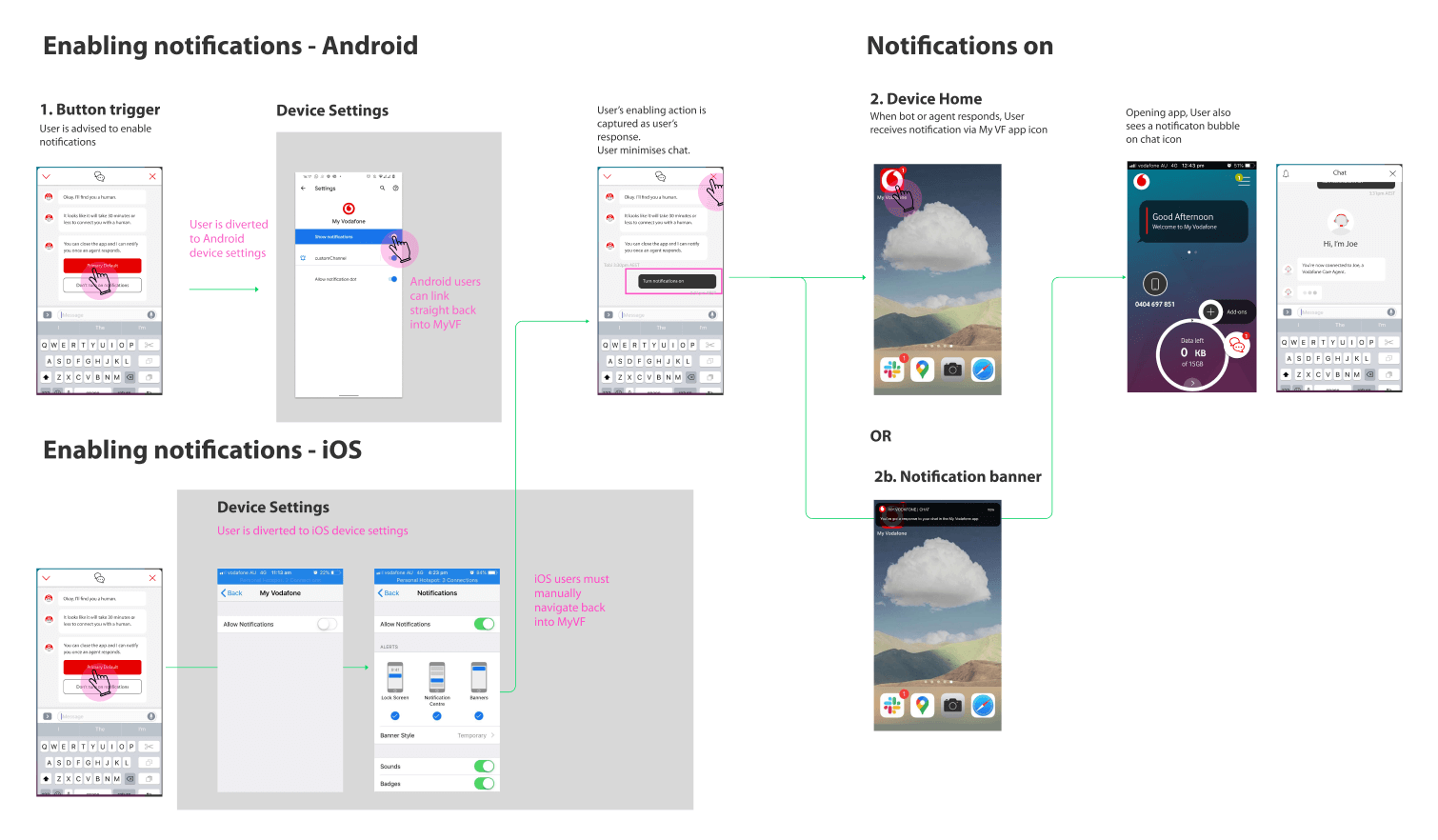
Designing a low-friction workaround for users to enable notifications
Our manual “allow notifications” workaround tested clean on both platforms—zero drop-off, even on the riskier iOS manual-return step
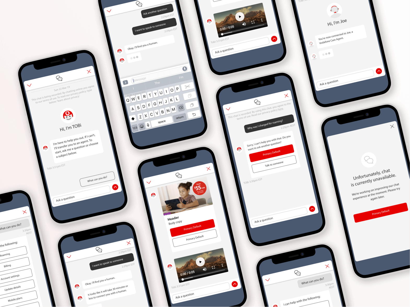
The final design
Outcomes
Despite the MVP’s limited scope, TOBi resolved 39% of customer enquiries in its first weeks live, taking real load off the Customer Care team from day one.
39% calls resolved
TOBi handled over a third of customer enquiries in its first weeks live
Minimised drop-off
Thorough multi-OS testing minimised onboarding friction
Globally aligned, within budget
Matched Vodafone Global’s design creatively to avoid extra build and budget
Tech limitations overcome
OS-level notification permissions weren’t possible on this platform, so I mapped and tested a manual fallback on iOS and Android before launch.
Built on real evidence
Customer Care interviews and research into common chatbot frustrations shaped the conversation flows, copywriting, and the four guiding principles behind every decision.